
Composition - From Rules to Freedom!
Composition is the most important aspect of creative photography. Exposure, focusing and image quality are irrelevant without well-composed content. A well-composed image draws the attention of the observer, irrespective of its technical qualities.
So what makes good composition? It can be subjective, but there are often similarities in the composition of successful images. Let's take a look ....
Rules and Religion
When studying composition, we come across some rules, mantras and theories.
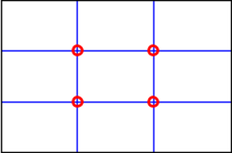
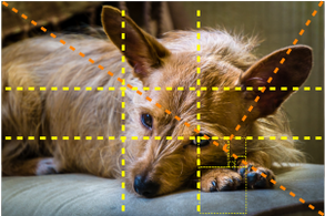
Rule of Thirds:
The most common compositional theory is the "Rule of Thirds".
Looking at the diagram, the idea is to place the subject or main compositional element(s) along, or near, one of the blue lines that divide the frame into horizontal and vertical thirds. Smaller elements are meant to be placed at, or near, where the third lines intersect (circled in red).
This is a good start for better composition. It keeps subjects away from the very centre and prevents horizons from cutting a photo into two separate compositions.
So what makes good composition? It can be subjective, but there are often similarities in the composition of successful images. Let's take a look ....
Rules and Religion
When studying composition, we come across some rules, mantras and theories.
Rule of Thirds:
The most common compositional theory is the "Rule of Thirds".
Looking at the diagram, the idea is to place the subject or main compositional element(s) along, or near, one of the blue lines that divide the frame into horizontal and vertical thirds. Smaller elements are meant to be placed at, or near, where the third lines intersect (circled in red).
This is a good start for better composition. It keeps subjects away from the very centre and prevents horizons from cutting a photo into two separate compositions.
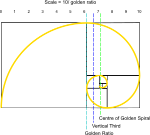
Golden Ratio, Fibonacci and Spiral:
For thousands of years, mathematicians, artists and others have been intrigued and inspired with a naturally recurring number known as the golden number or golden ratio, 1.618 and its mathematical cousin, the Fibonacci sequence.
The golden ratio and Fibonacci sequence can be found in the proportions of things in nature including plants, trees, seashells and our DNA.
Intrigue and obsession with the golden ratio have led to it allegedly being used in the design of buildings (from ancient to modern times), products, graphics, corporate logos and more. It has also been cited in theology and spirituality.
The diagram above / left depicts the typical rectangle with a "golden" aspect ratio (width to height) and internal divisions reducing at the same golden ratio. It also depicts the corresponding logarithmic golden / Fibonacci spiral.
OK, so what do you do?
Here's my take on it:
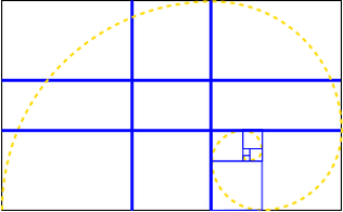
It depends on the content of your image of course, but generally, you place larger or linear objects on the blue golden ratio grid lines.
Smaller features should be placed slightly more towards the corners of the frame near the smallest of the descendent golden rectangles, which is also the centre of the golden spiral.
If you have a live view/ mirrorless camera (CSC/ compact/ bridge), you will usually have options to display some form of a grid on your screen and/ or in your viewfinder.
If you use a DSLR, you'll have to use your imagination.
Here's my take on it:
It depends on the content of your image of course, but generally, you place larger or linear objects on the blue golden ratio grid lines.
Smaller features should be placed slightly more towards the corners of the frame near the smallest of the descendent golden rectangles, which is also the centre of the golden spiral.
If you have a live view/ mirrorless camera (CSC/ compact/ bridge), you will usually have options to display some form of a grid on your screen and/ or in your viewfinder.
If you use a DSLR, you'll have to use your imagination.
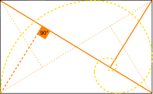
Another shape from the golden ratio is the golden triangle (illustrated on the right/ above). Here we have a line running between diagonally opposing corners and other lines adjoining at 90º from the remaining corners.
As well as locating the centre of the golden spiral to place subjects, this is also good for positioning diagonal elements, lead-in lines and diagonally juxtaposed subjects.
As well as locating the centre of the golden spiral to place subjects, this is also good for positioning diagonal elements, lead-in lines and diagonally juxtaposed subjects.
It's worth noting that the intersections of the thirds, the golden grid and the centre of the golden spiral all lie on the main corner-to-corner diagonal.
Lead-in Lines
Lead-in lines (AKA leading lines) are used to direct the viewer's eye into the composition, and often directly to the subject/ primary compositional element.
Lead-in Lines
Lead-in lines (AKA leading lines) are used to direct the viewer's eye into the composition, and often directly to the subject/ primary compositional element.
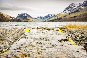
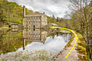
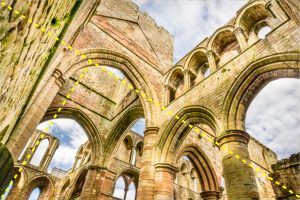
Often, available lead-in lines will be diagonals from perspective and convergence in the scene. But lead-in lines can also be curves, "S" shapes or "Z" shapes.
There can be several lead-in lines, all co-operating with each other, just one, or none. It depends on what the scene has to offer.
There can be several lead-in lines, all co-operating with each other, just one, or none. It depends on what the scene has to offer.
Lines and Shapes
Lines and shapes can play a big part in a successful composition.
Successfully arranged elements can involve familiar shapes such as squares, circles and triangles.
Repetition, cadence, pattern, and texture can all strengthen a composition.
Horizontals can evoke a sense of stability while vertical elements give a sense of power and majesty.
Diagonals add drama and a dynamism. And as mentioned above, converging perspective lines can double as lead-in lines. Get close in with a wide field of view and put the diagonals to work in your image!
Diagonals add drama and a dynamism. And as mentioned above, converging perspective lines can double as lead-in lines. Get close in with a wide field of view and put the diagonals to work in your image!
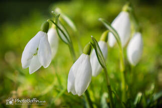
Figure to Ground
This applies mainly to portraiture and helps to define the subject and, in particular, its shape. But it can also apply to landscapes and other genres.
It's a principle of contrast. Either lighter against darker, darker against lighter or subject colour(s) from its background colour.
The image to the right/ above has effective figure-to-ground in that the white snowdrop petals are sharply defined from the green, out-of-focus background.
Figure-to-Ground can be a particular consideration when a subject's shape is of particular interest.
Negative Space
Negative space is the space around the subject(s) or compositional elements. It's the ground in Figure to Ground. It can be plain and empty of detail, or it can be contextual to show the subject in its environment.
Negative space can be used to strengthen the "story" of an image. You could include lots of sky to augment the peaceful solitude of a loan subject. You would usually leave more space in the direction into which a subject is either looking or moving - unless they're walking away from the context; then you would do the opposite.
There are many ways that negative space can support the subject(s) or compositional elements and complete the story the image is telling. It just being free from distraction helps support the subject and the image as a whole.
Odd Numbers
When you have multiple subjects, odd numbers often look much better than even numbers. Two can work, and it helps to position them diagonally. But 3 and 5 will often look better than 4 and 6. I think this maybe because they cannot be divided equally, which would concur with the main "rules" of positioning.
Framing, Depth and Perspective
Photos are two-dimensional, and, particularly with landscape photography, we often want to make them look as three-dimensional as possible to capture the drama and majesty of the scene. This requires defined scale - foreground, midground and background.

As well as simply including these in our composition, we can emphasise the scale by getting closer to the foreground element with a wider field of view (wide angle). This will expand the perceived distances between foreground, midground and background, and the foreground will look larger in the frame and more relevant to the composition.
Simplify
Be ruthless with this. Keep it simple! Don't try to include too much or you'll lose impact. You have to prioritise for the sake of the image. Be pragmatic! Exclude and simplify.
If something isn't part of the story and doesn't support it, eliminate it!
Freedom!
Don't be bound by obsession and blind faith in any "rules" or theories. You now have some insight into the compositional qualities that can help you to create your images. Composition is about balance and telling a story.
Observe, pre-visualise and hone your images.
View the proposed image from different angles in order to move the compositional elements around the frame. Try low down, waist height and up high at arm's length (the latter with live view and a tilt screen). Observe as elements move around, overlap and separate, and you decide where you want them.
Allow a little contingency "wiggle room" for post production cropping, rotation and perspective correction.
Be creative with of what you see. Don't obsess about how things might look in different light.
You can bear the theories in mind, but don't let them override your judgement.
Proportion, balance and coherence are what we're aiming for.
